I just finished a complete overhaul of our User Interface system. This is a big deal because the Interface library has been an integral component in our engine, not to mention the fact that it was the product of many months of work.
Now that the redesign is complete, I wanted to take this opportunity to outline some of the decisions that were made and discuss why the redesign was needed in the first place. To keep things straight, throughout this article I will refer to the old system as “UI 1.0”, and the new system as “UI 2.0”.
A Brief Overview of UI 1.0
UI 1.0 was encapsulated in a single library called Interface. It was one of our largest libraries due to the number of controls it implemented:
|
|
The Interface library was based on the set of controls I had created for our XNA codebase a couple years prior. For the most part, I was able to directly port the behavior logic into Sauce; however, for the visuals, our requirements were quite different. In particular, we wanted to support different variations of the controls: a basic one for our testers as well as one for each of the game projects.
To satisfy the requirement of visual variation, UI 1.0 was built around the concept of Styles: each Control (Panel, Button, CheckBox, etc.) had a corresponding Style (PanelStyle, ButtonStyle, CheckBoxStyle, respectively). Each control Style was an abstract interface which was implemented by our different variations.
An example for Button:

In Model-View-Controller terms, the Control classes encapsulated the Model and Controller components, while the Style was the View. This made sense because regardless of how it looked, the behavior of a Control remained unchanged. So the idea was that Controls could be written once, and custom Styles could be derived from a corresponding abstract base class.
In practice, a Style pointer would be assigned on each Control, which simply forwarded on the task of rendering to the Style (if it had been assigned). Also, Styles were designed to be shared across multiple Control instances. This way, we could adjust a Style and all the associated Controls would instantly be updated.
Design Flaws
While we had been able to use the Interface library with this feature set for the good part of the last two years, unfortunately, there were a couple of fundamental problems with its architecture that prevented us from doing some essential things.
First, it turned out that most (if not all) of the data members from the control were needed to render its visual representation. This spiraled into a mess where some Style routines required nearly ten parameters each.
Not only was this painful to work with, but it also gave rise to another problem. Some derived Styles required certain data while others did not; however, the only way to access the “extra” data was to add it to the parameter list(s) in the Style base class. This led to several verbose and sometimes unintuitive interfaces.
Second, as mentioned earlier, Styles were designed to be shared. While this meant that we needed less objects, it also meant we were unable store any state for the purposes of rendering. In other words, Controls were required to house all of the state data. This broke two things: 1) a Control now needed to keep visual data when it was intended to only be the model and controller; and 2) new Controls needed to be written to support different views — which was the exact problem the Styles architecture was attempting to solve in the first place.
For example, there was no way to create a Button with a glow that would pulse. Since all Buttons were tied to the same Style, glow state data would need to be stored in the Button — but not all Buttons need a glow state!
Eventually, I realized that both of the design flaws actually stem from the same issue: MVC declares that the components should be separate (read: independent), but that should not be confused with restricted access. To be effective, the visual component needs access to all of the data about the Control, as well as have its own state data.
Introducing UI 2.0
Considering the issues outlined above were architectural, I knew that the UI system would have to be redesigned. There was no doubt that this was going to be a huge undertaking, so I decided to make a prioritized list of goals:
- Remove Styles and migrate to system where Controls are responsible for display
- Design for Composite Controls
- Implement a real Scrollable Area Control
- Support for Nine-Patch based Controls
- Improve rending performance
- Animation support
I eventually tabled the last two since they require some groundwork to be completed in our Graphics system before they can implemented. Perhaps they will be at the top of the list for UI 3.0…
Redesigned Control Hierarchy
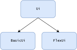
For 2.0, I decided to create three separate libraries:
- Ui: contains the abstract base classes for standard controls.
- BasicUi: contains an implementation of Ui controls, using simple borders and backgrounds.
- FlexUi: contains an implementation of Ui controls, using Nine-Patch for visuals.

Each Control became an abstract base class, establishing the interface and handling the behavior logic. At the same time, Styles were removed and their functionality was extracted into respective derived classes.
Composite Controls
Trying to create composite Controls in UI 1.0 was really painful. Styles would have to be passed down through the Control interface. This cemented the sub-controls utilized by the composite, stripping away flexibility.
In UI 2.0, I wanted to be able to use sub-controls without them being baked into the interface of the Control; in other words, I wanted them to be implementation details, which is what that they actually are.
![]()
My primary test case for Composite support was the NumericUpDown. In UI 1.0, the NumericUpDown had two buttons (+/-), but the value display was just static text, which could neither be edited nor copied. I really wanted to replace the static text with a TextBox control, but the Style framework was posing as an obstacle instead of a means to a solution.
By implementing the Controls as a hierarchy with an abstract base class, creating Composites fell into place naturally. This was a pleasant and most welcomed surprise, especially after working with the mess in 1.0
The only difficulty I found was in determining where to place the sub-controls. In the NumericUpDown, I used virtual functions to instantiate derived versions of the TextBox and Buttons, and then used their abstract interfaces in the update logic. While this works just fine, it feels a bit inside-out. As I mentioned above, I came to the conclusion that sub-controls should be implementation details. To stand true to this statement, the TextBox and Buttons should really be created and updated in the derived controls instead of in the abstract base class. However, structuring Composites in that way also means that there is bound to be a decent amount of duplication of the update logic code in each of the derived controls. So at this point, I’m ambivalent as to which design is superior.
Scrollable Panel
UI 1.0 included a proof of concept implementation of a scrollable panel: ScrollPanel. Unfortunately, I quickly realized during development that there was just no way to add child Controls to the scroll canvas.
Scrollable Panels are a must-have feature for our target project, so this had to be addressed.

In UI 1.0, a ControlManager class handled all the rendering and intersection traversal through recursion. This was possible because the Control base class had a list of child controls that the ControlManager could access and manage the flow. As such, Control implementations were very simple since they were only responsible for rendering themselves. However, this setup was far too rigid and did not allow for Controls to render children within their Render() function.
For UI 2.0, I decided that each Control would have to be responsible for intersecting and rendering their child controls. While this places a lot more of a burden on each Control, it enables us to implement a virtual canvas for the ScrollPanel’s child controls. In practice, I found this structure to be a bit more intuitive than the former, since there is less code “hiding” in the base Control class implementation. It also made the base Control class a lot more lightweight, which is always a good thing.
Building a scrollable panel is no simple task. There are a lot of details to consider when intersecting and rendering a virtual canvas. Aside from getting the architecture right, this was probably the most difficult part of implementing UI 2.0.
Nine-Patch
As was the case in UI 1.0, I wanted to have two distinct sets of controls: one for tester widgets and a dashboard, and another set for in-game UI.
For the most part, I have made use of the first set, which I call “Basic UI”. Basic UI Controls are visually simple: solid color backgrounds, borders, simple text.

I dubbed the “in-game” control library: Flex UI. The controls are primarily based on using a Nine-Patch to draw their backgrounds and borders.

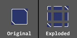
A Nine-Patch is actually just a single texture sliced into 9 parts (as shown the in the figure below). The benefit to using a Nine-Patch is that you can keep crisp corners and edges, while stretching the texture in the directions you would naturally expect.

The only caveat is that you need extra data to know where to make the slices. For now, the Flex UI assumes that the corners are 16 x 16 pixels, but the intent is to make the system more robust to accept any slice sizes.
Stylesheets and Factories
At the very beginning of the redesign, I was hoping to implement some sort of Stylesheet system. After attempting a proof of concept, I realized that the same types of problems I had been trying to avoid were beginning to make their way back into the system. Consequently, I tabled the idea.
Later on in development, I resolved that the best way for Composite controls to create their sub-controls was for all controls to have access to a ControlFactory. So I created the ControlFactory as an abstract base class that is implemented by the Basic UI and Flex UI systems.
As it turns out, the ControlFactory is actually the perfect place to put the Stylesheet since the visual data can be applied to the corresponding control type. The only thing missing (without some substantial changes) is that the Controls cannot be updated dynamically if a Stylesheet is modified. I decided that while such a feature is cool to have, it would never be used in a final game project.
Final Thoughts
Although it took me a few months to complete, the UI 2.0 system is now in place and being used by the rest of the engine in the same capacity as the old Interface library. The effort was well worth it. I feel that the new architecture is far more flexible and extensible than the previous. Also, in addition to bringing the new features online, the overhaul gave me a chance to address a lot of the little things that had been bothering me, which is always nice.